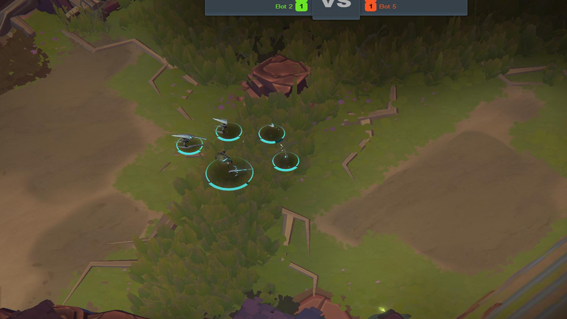
Art Map visibility Feedback
As requested by @Artillery.marktillery here is my feedback on the gameplay visibility on the art map.
1 : The bushes look kinda like the normal grass at first glance. This is really much worse with low shadows

2 : The healing Plus is hard to see on some of the backgrounds.

3 : Units pop less at low shadows. Basically the opacity is a bit lower then shadows on High.
Other then that, the map seems to be totally rad!!

Comments
Some preliminary feedback after just 2 games on the arted map, gonna look for more in my 3rd game now too:
Unit Health Bars
I'm actually very happy with health bar visibility on the arted map, I found it actually easier to see when my units were getting low on the new map. Great color scheme choice!
Right on! thanks @Burdock and @AlienTree for the art feedback! I'm glad you're having a good experience on the map so far! We're always looking to improve and iterate on the clarity of the art, in how it services gameplay, so comments like these really help us moving forward. thanks!