Top-down map image
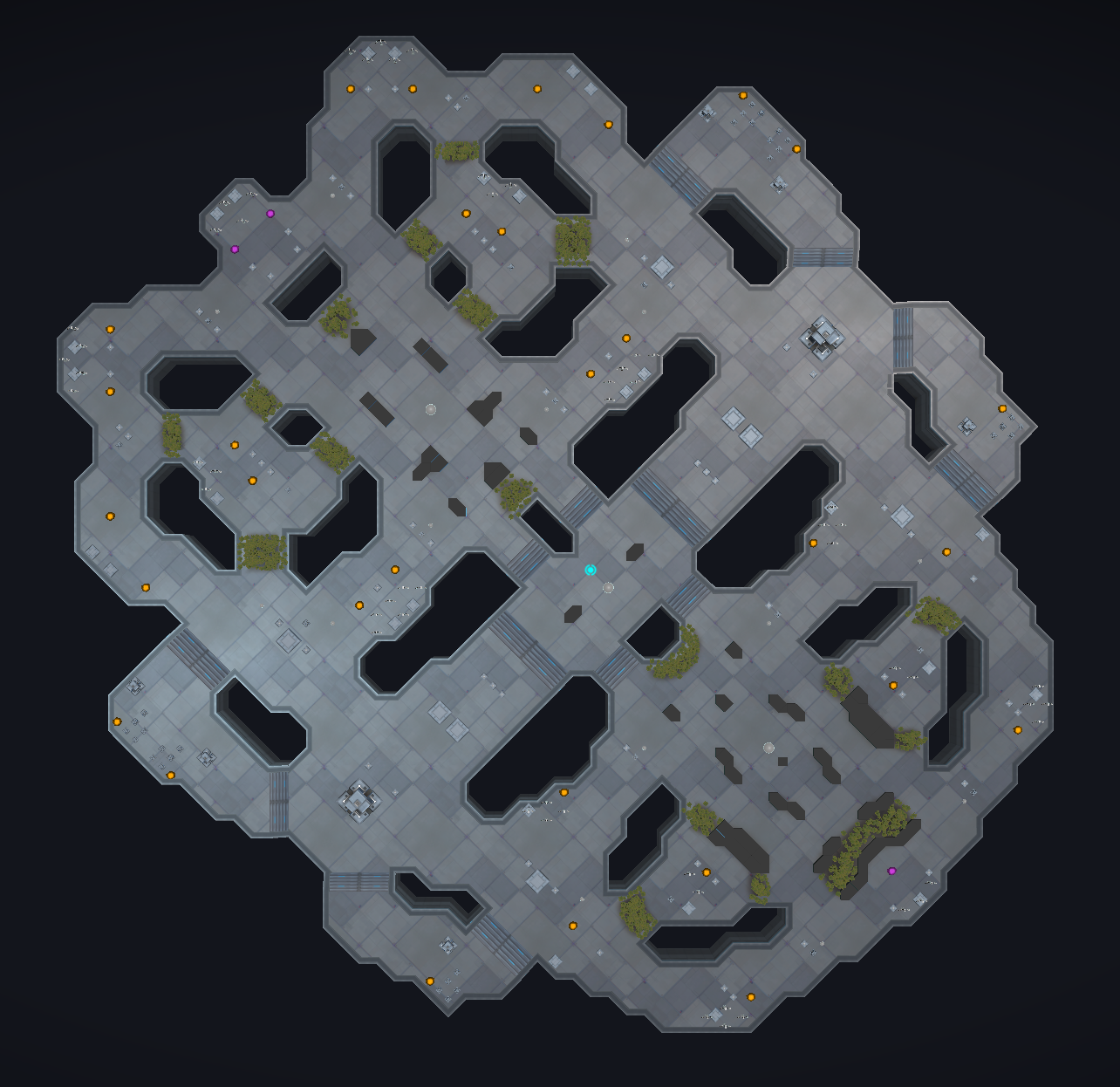
I was asked for a top-down view of the map for use with mocking up paths and strategies. Here you go!
Edit: Note that this is our primary PvP map and it is completely un-arted. We'll be opening up some PvP play on our stunning, beautiful arted map for few hours on Sunday the 13th.

Also, if you go to https://atlas.artillery.com/atlaspedia you can get links to unit portraits and ability images for use in posts, like so:
<img src="https://artillery-asset.artillery.com/9ef8f4f98cb817c45ab41b38a72adf0b" width="100"/>
Enjoy! (And please remember to respect our NDA  )
)
Comments
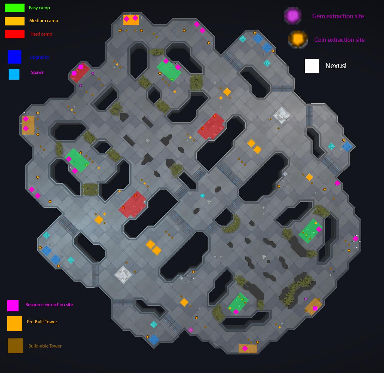
Colored map with key (kinda crappy photoshop)

Awesome!
Hi everyone!
I wanted to update this thread with a top down image of the map from last night's playtest (#190 on Feb 17)

some of the landscaping might look a little different than what you saw, but the map layout is the same
-Bob
Outlining my favorite part makes this awesome map look like a hockey mask.
oh god @CohLysion i am dead
Hokey mask... Or..?
Updating the thread with a more up-to-date topdown map
GLHF everyone! WOOHOOOOOO!
Highlighted map!
GREEN = Easy camp (scrap)
YELLOW = Medium Camp (scrap)
RED = Hard Camp (gems)
PINK = Medium Gem Camp (Drops harvestable gem nodes that don't despawn)
Orange and Yellow = Mega Camp (Gems and Scrap)
Pink, Orange and Yellow = Mid Mega Camp (Lots of gems)
Howdy Everyone!
I thought i'd pop in with another top-down map update for Test Weekend 3!
GLHF! WOOHOO!!!
-Bob
Howdy folks!
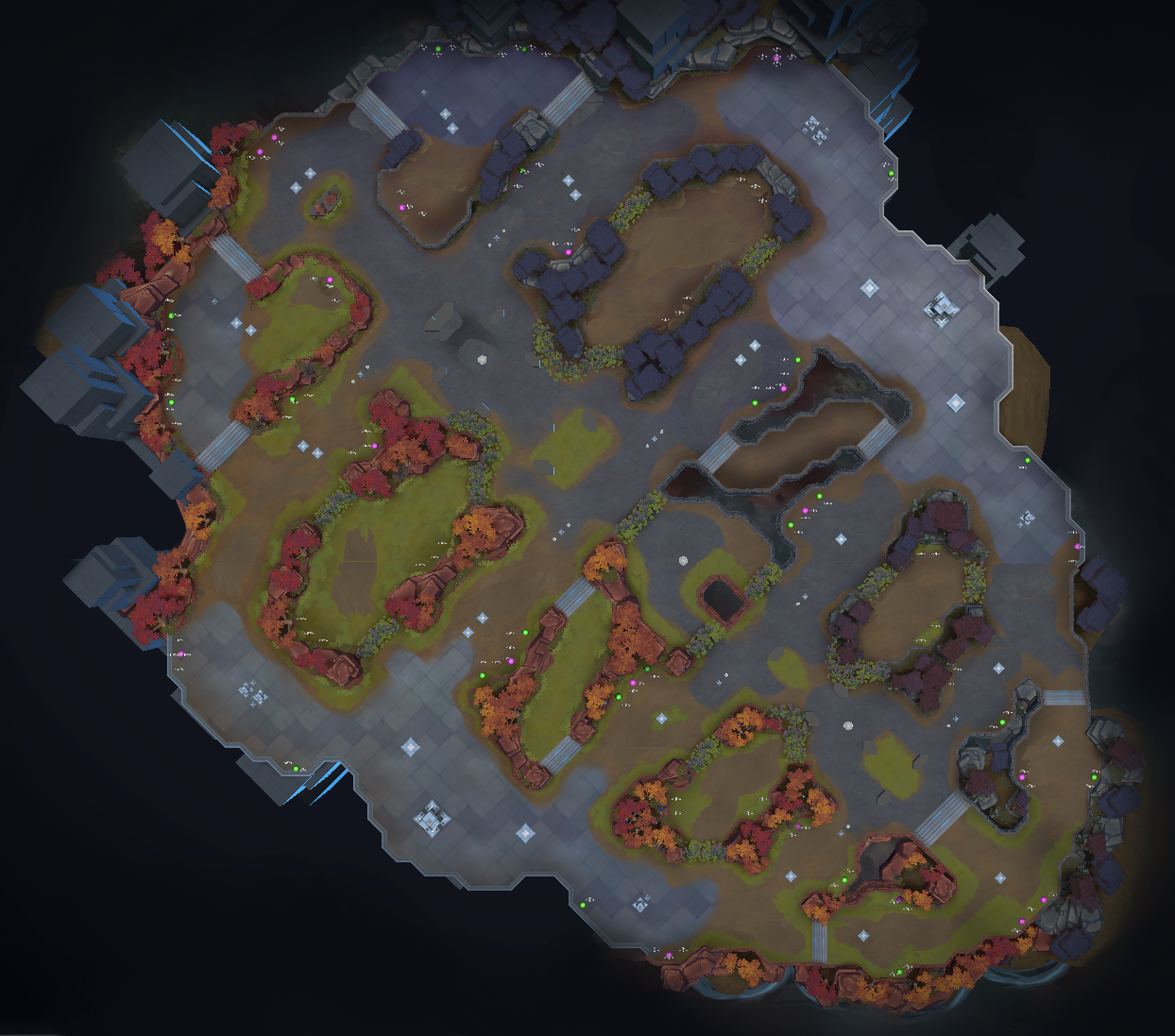
I wanted to bump this lovely thread with a top-down map shot of our Test Weekend 4 map! WOOHOO!
GLHF, and i'll see ya in battle!
-Bob
Sadly I will not have a chance to make a highlighted version before Saturday ~that being said~ Thanks for the rad community support Bob <3
howdy hey, everyone!
I just thought i'd pop in and post a top-down image update to the current map
-Bob