Art Feedback [TW2 Megathread]

Models, animations, sounds, visual effects and particles, textures, environment, icons - it all goes here! In addition to how it feels, also let us know how our art adds to or detracts from gameplay.
When providing feedback, please use the following format:
- X happened
- It made me feel Y (or I’d like to feel Y)
- (optional) Here’s a suggestion to improve it
Comments
The sounds of the game is very boring.
When I captured a gem node I felt rewarded mechanically as in I obtained a super valuable resource. But the sounds of me obtaining that resource don't sound that great. What I find Interesting is you guys have no intention of using an announcer in anyway shape or form. This is much different than what people are used to, and will turn people away from the game. Almost all RTS games have some form of audio that tell you clear information. I want to play a game that is visually, mechanically and audioly stimulation grabbing my whole attention and focus and totally immersing myself into the game instead of only the first two. TL'DR announcers are great for RTS games Just over doing it can cause a lot of problems.
X happened: Just general gameplay.
It made me feel: bored, uninterested, uninspired, and kinda a little sad.
Explanation: First of all, I would like to apologize for the above remark. I understand this isnt a finished game. Second, I am genuinely concerned about every single facet of the art style. However I am the most concerned about two very specific things that very much turn me off to the game. They are the unit models/animations/etc, and the unit sounds. The sounds I am willing to accept that they probably just arent done yet.
However, its the unit models/animations/etc that have me the most concerned by far. Everything looks and feels hollow. Everything looks like its a paper cut out. The animations feel like a combination of graceless floating and also at the same time still very mushy and unresponsive. The sounds are largely the same way, but again, I am guessing they just arent finished.
But lets address the art style. Think about LoL. Every single champion oozes personality. It just drips off the champions. Think about a champion like Yorick. No one even plays him anymore, but he still has that personality. I feel like Im a crippled grave digger running out on the rift. I feel like my ghosts are actually legit ghosts when I summon them. Think about Caitlyn. Think about how she shoots her gun. She has a very deliberate aiming animation, she shoots a very audible pew. Now think about that fifth shot. The headshot bullet loading. God. I can hear it right now and I havent even played League in weeks. That head shot bullet loading into her rifle is iconic. Its meaty. It makes me feel like Im itching to blast someone in the head with it. Think about everyones animations. They are very much decisive. Think about Ezreals ult. Does he just have a cast bar appear over his head and then shoot a giant wave? Not even a little bit. He pulls himself back. You can see the strain on his character model. You can hear it in his voice. The result is a giant wave that feels super bad ass. Like I worked hard to get that wave out myself.
Think about Dota 2. Same story, but Dota 2 just doesnt quite live up to the same standard of "meaty"ness. The heros in Dota 2 still feel good, but the raw personality isnt there. The art style is a bit more watered down. The animations arent as decisive. Its still a good game, but in my personal opinion, the heros just dont feel fleshed out.
Think about Diablo 2 or 3. Think about how those characters feel. Each character feels like they know exactly what they are doing. They are there to slay the minions of hell and you, the player, are just there to guide their wrath.
Think about Starcraft 2. Think about a swarm of zerglings. Even if you only have like 16 lings, it still feels like you are controlling this pack of savage raptor dogs that want to bite holes into absolutely everything. I hope we have all seen pro SC2 players get cheeky with a single ling. Its because he feels good about that ling. He knows that ling knows the drill, and its just up to the player to execute.
Finally, think about the animations of all of those games. They are all deliberate, controlled, and decisive. Everything feels swift and full of purpose. If you want your character/units to move, there is no hesitation. Mind, body, and game are working in sync.
The common theme here is that all these art styles inspire massive amounts of confidence in the player, whether the player is good or not. I do not get any such feeling from the current art style. As I said, the models feel weak. Flimsy. Origami cut outs. For example, take the current state of the Raptor from Vela. That character model is great. I wish it was moderately bigger. I wish I could see the charging up of each shot. I wish I could see some kind of blue trail like a SC2 probe behind them. I wish I could see the circuitry pulsing inside of them. I want to feel like I could swarm someone with these long range sniper probes. But I dont feel like that. I feel like I dont even want to engage because they look weak. They dont inspire confidence.
**Take away: I want my units to inspire confidence in me. I want them to tell me that they have my back. I want to feel like I failed them, and not that they failed me. As soon as I feel like my units failed me, I no longer wish to play the game. **
Here are some specifics about what I am talking about. Some units look great. Like the Purifier. I feel like as soon as I set that thing down, its going to start blowing crap up and I love it. I feel like I can rely on it. I wish it was a touch faster to get up and down, but thats beside the point. Next, lets look at the Sandstinger. This unit reminds of enemies from Starfox 64. What is this. Is this a bird? It looks like a bunch of triangles. Real intimidating. Its little red balls feel like they are gently thrown kush balls regardless of whatever their actual damage is. On the same squad, look at the Devilkin Dervish. Hell yea. This dude looks sweet. He looks like he is runnin around with his big ass staff ready to pound some shit into the ground. I always wish I could have more of him. Lets look at the Apocalyte while we are talking about the Eris squad. This dude needs to hit the gym. He looks like a strong breeze will blow him out like a candle. I aint scared of this dude whatsoever. His meteor is pretty sweet though. Im just amazed that his scrawny little ass dude could call it down.
**DISCLAIMER: I wish to convey that I absolutely understand these are my OPINIONS. I could be in the complete minority. This is also not a "lets diss the Atlas team". Creating a brand new IP from scratch must be tough work and as a software developer myself, I have immense respect for them. However, I just wish to see the game succeed. **
Theres my 2 cents. Also Atlas Art team, I love you. Please dont hate me.
Two pieces of feedback:
I understand that this is a technical pre-alpha, but the art and sound is so bland that it actually is affecting gameplay. Everything is just too abstract, to the point that I can't understand the game even after watching the tutorial. There needs to be a much broader range of contrast so that, visually, I can understand how much I should desire a reward over other rewards, how much I should be afraid of a threat versus other threats, and some kind of clue as to what each building and unit does.
When I started my first game I looked at my base.
It made me feel concerned.
The buildings look two dimensional and boring. I assume you just haven't done them yet, but buildings really do look "Eh" at best.
YAY! Art feedback! Thanks for writing up your thoughts everyone! Seriously! I love this stuff!
@Lisarah - Audio adds tremendous impact to every game. It's something that provides context and clarity to a player's interactions. It can help your actions to feel truly powerful. We totally get this! And I doubt you could find a single person on the team that would disagree with your sentiments. Honestly, we haven't addressed audio much at all, at this point. As the game continues to get more clarity in focus on interactions and game context, it will start to make more sense to invest time and resources into making audio something that will enhance the game. what's there now is purely a pass in giving you feedback that your interaction had an effect.
@atzero - thank you so much for your thoughtful and passionate feedback regarding the art of Atlas... seriously! The fact that you care so much already, really means a lot to us. You make some really excellent points! Thank you! One thing that i'd like to mention, based on my game dev experience, is to never underestimate the power of Audio and VFX. Each of the game comparisons you've made have absolutely top tier attention paid to VFX and Audio... those are two major experiential components in communicating power, nuance, and character to units in a game. Audio and VFX are two departments that we are only now starting to get some traction on, and there is a LOT left to do in those departments. The art of Atlas will absolutely continue to evolve, and improve! visual design and animations are done in phases, and we embrace a highly iterative process... nothing is ever "done"") We hear you, clearly. I genuinely hope to hear more of your thoughts about art as Atlas continues to evolve, visually. thanks!
We hear you, clearly. I genuinely hope to hear more of your thoughts about art as Atlas continues to evolve, visually. thanks!
@nickpettit - i hear ya! Nearly all of our building art is placeholder at the moment. as design requirements for building structures evolve, it hasn't made too much sense for a small art team like ours to spend too much time and resources on building unique structures. we absolutely will, and trust me... no one would like to get those current building assets replaced in the game more than i") Some of the animated tower nodes and the nexus are examples of recent art passes on some structures, but as they don't currently have a lot of visual context in the world yet, they can still seem a bit out of place. My comments to @atzero and @Lisarah will probably shed some light on our current state of Audio and VFX, so i hope that can be helpful in regards to your comments on those subjects.
Some of the animated tower nodes and the nexus are examples of recent art passes on some structures, but as they don't currently have a lot of visual context in the world yet, they can still seem a bit out of place. My comments to @atzero and @Lisarah will probably shed some light on our current state of Audio and VFX, so i hope that can be helpful in regards to your comments on those subjects.
@mrwizard70 - OHHHH i hear ya! i really do! we haven't spent much time on those assets at all... I assure you that when it makes sense to, logistically, we'll make sure that those assets get the attention and love that they truly deserve. Thanks!
KEEP THAT ART FEEDBACK COMING! YAY DISCUSSIONS!!! <3
Heyo!
Just wanted to add my input for some artsy stuff, hopefully I don't repeat what has already been said. I have talked about it in the global chat in the game client, but I wanted to make an official record somewhere to help.
Besides that, I don't have much to say, other than keep up the fantastic work! I am loving the game so far, you guys have done a lot since the last public test, its great! Woop woop!
@Rundar
Great feed back, thanks for taking the time to write down your thoughts!
1)
Grath has been among the most lost units in the game for sure. We have plans to address that for sure! Readability is a constant struggle because we want to balance the aesthetic we want vs the fact that players need to know at a glance exactly what is theirs, and what isn't.
Also, we're hoping UI elements like unique health bars or player names could help you find your hero at a glance. Just haven't gotten around to doing it yet!
2)
Love the merc feed back, this is a very new system for us and we definitely wanna be sure to find a way to make you know that the mercs you bought, are yours! We're hoping that after more and more games get played as the weekend goes on we'll learn exactly what we should do to tackle that problem.
3)
You're totally right about the gems, our resources are constantly in flux because of how many systems we test. When we get further along in the process we'll be sure to unite that stuff for a strong narrative and for more cohesion in the experience.
4)
Buildings are something we are working on right now! Some of them have been addressed but we really wanna be sure that players know at a glance what is theirs. We don't want to much confusion the first time a player plays trying to find their base vs the identical one next to theirs. Wondering why you can't click your buildings is the last thing we want a player to do!
5)
Replays will keep getting better and better, we think it's a SUPER important part of the experience for you guys. Being able to quickly share, watch, and learn all in the client is a huge part of the environment we are trying to build.
Thanks again for the feedback! Feel free to post more! We love hearing positives but don't be afraid to go even more negative about things if you want, just be sure to use Sean's method of "I felt x when y happened"
Cheers!
@Enderdxg
Thanks so much for the feedback! We absolutely feel your pain about health bars and cooldown bars. We iterate so quickly on so many systems that some end up staying the same for a long time. One of those is our health bars, over the coming months of development we'll definitely be taking a much closer look at those 2 things.
Our vfx artist is hard at work working on building out a ton of attacks that are readable and really fun. I'm excited for you to come back in a while and see the progress!
Thanks again for the comments.")
Hey, so just a few things I have noticed (Apologies for the potato quality images, it appears to be making them bigger and stretching them out and I am to lazy to deal with that):
1: Some of the units look fairly similar which can make things visually confusing, especially if they are from a squad you don't play and aren't super familiar with. When there is just 4 like in the image below it isnt as bad, but when you get a larger squad it can be confusing
Example: Rymes units
2: Be careful with the use of colour on the maps and the units. Some of the greens used match the map very when which can make them hard to see when there is action on the screen.
Example: Velas green cloak
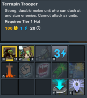
3: Make the squad unit caps a little more obvious. I feel like in the tool time of the unit it should display how many of a unit type you can have. Right now you just have a little number in the icon. In the picture I attached, it shows that I can build like 11 more terrapins, I feel like that could be more obvious what it means. Its just a tiny 11 in the corner of an Icon
@Anderr
Thanks so much for taking the time to write up some art feedback for us! Also love the images so we know exactly what you're talking about. helps us so much!
Great tip on the squad cap, that's a super important thing and we should let new players know how many they can have so they can strategize from day one.
We definitely are doing a pass on Vela, she needs more tones of color, we've heard before that units that are flatter in their colors tend to get lost which in that screenshot is definitely true.
Thanks also for the thoughts on how similar some units tend to be. We are constantly tuning between uniqueness and uniformity with the squads to either push apart or pull their identities closer.
Every bit people tell us helps us make a better game! thanks again! See ya sunday for PVP I hope! Cheers.
I tried to attack my ally. Got annoyed. Tried to help an enemy. Got really annoyed. The unit colors are all different. Make my health bars green (or blue for color blind people), allied HP bars yellow and enemy HP bars all red. They don't need to be player color when the units themselves already have player colors.
@burnmelt Right now we have blue HP bars for your own units, green for your allies, and red for enemies. If that's not what you're seeing on the screen, its a bug - can you please post a screenshot of what you're seeing?
We used to do green, yellow, red as you suggested. I don't remember why we changed it but I can find out if you want.
Bah, you're correct it looks fine. Honestly I'm not sure why I was getting so confused my first few games. Seems obvious a few games in now.
@burnmelt
-that's still a great thing for us to be aware of, we want the experience to be smooth from game one. Thanks for your initial comment and also replying after you played some more games!
Experience: They are definitely on the small side.
Feeling: I felt like it was hard to tell them apart much less micro individually.
Solution: Make bigger or increase differentiation. Different colors on the same team would be useful. All of Ryme's duders are blue. Maybe a dark blue vs. light blue would be enough.
Experience: SauceNinja's son says "Seriously I won't violate the NDA. What's the storyline?"
Feeling: "I don't know. I'm trying to micro."
Solution: Seriously, what's the storyline?
I don't know if it is placeholder art, but all of the buildings looked the same. It would be great if the buildings looked really distinct from one another, and specifically if buildings were themed around the squad with which they were associated.
@BanthaFett
Thanks fort he feedback Bantha! They most certainly are placeholder. Once things solidify on the gameplay side we'll be sure you guys can tell what is what at a glance! We want them to tell a story just as much as any other aspect of the game. Be sure to stop back for more playtests and see their progress!")
@SauceNinja
Hey Sauce!
The storyline is a work in progress but we aren't ignoring it for sure! We think what we'll be unveiling is a fun and hopefully in depth enough for the folks that really wanna dive into the lore.
As far as Ryme's unit we've heard that a lot and I actually hope to do some work on that very soon! Before the next test weekend for sure. I don't want you guys being hindered by our art in any way! Hopefully you can use the new artwork next weekend and lemme know how it feels!
Thanks for posting your feedback! Cheers.
On the topic of health bars, I felt very confused at first as to the many different bars that show up in the middle of a fight.
If I'm near a tower and an enemy comes to engage, suddenly there's a bar for:
1) Tower shields
2) Tower attack speed
3) Enemy minion health
4) My own unit health
5) Plating (if there is any)
6) Smaller unit shields
7) Other unit attack speeds
I may have missed some, but that's a lot of information to take in as a new player and I felt very overwhelmed. I personally don't think the attack speed bars are necessary. And maybe the shield bars could be coloured differently, rather than having a light pink shield over a red health bar. It could be blue for shields and red for health.
Thanks for the feedback @Shambles299!
As a novice RTS player I'm pretty overwhelmed by our health bars most of the time but even our very experienced players find themselves questioning what's going on with them all too frequently. We're going to be working very hard on these systems really soon! Hope you can come back in the following test weekends to comment on the progress of them!
I was just perusing, and I had a little idea, building off of what I said before in terms of the squad specific buildings. It would be a challenge, but doable in my opinion. The nexus, and the pre-built towers (underdomes?) could also have a specific flair to them as well. You could have an element of each squad built in, so that way the buildings you don't build can have a visually interesting element to them as well. There would be many combinations because of the number of squads, and you could have the parts/elements of the buildings relate to the starting positions of characters. Ex: Alder starts in the "top" position of all the players, so he gets the top of the buildings with some plant stuff, Ryme in the "middle" gets the middle of the buildings with some cool ice stuff, Vex at the "bottom" with some fire or lava stuff. Super basic right there, but you could have a more integrated setup than that. Just an idea, I think that would be a super unique element and would definitely add to the game.
I realized recently that in-game I always think of Glacial Rangers as spiders, although their portrait looks nothing like that. It made it harder for me to connect Rhyme (cold) with spiders and realize which squad it was. I think it's because the bubble behind them looks like an abdomen.
First time I saw Rustborn Rhinos in game, I mistook them for mercenaries, because they show so much metal.
@Rundar those are some ideas we've absolutely been tossing around for a while, actually.")
@wondible ha! that's a really good point about Rustborn Rhino!