UI suggestions!

I didn't get a chance to finish my UI feedback mockups due to having to edit the Discord Feedback (2).
That being said I just kinda wanted to leave this stuff here, maybe some of the suggestions will stick 
HP bars
It's an issue. I don't think I need to go into much detail as to why. I personally would recommend making sure units don't overlap their HP bars. One option would be to have them be visible when covered (with a little opacity).
EXAMPLE (╯°□°)╯︵ ┻┻

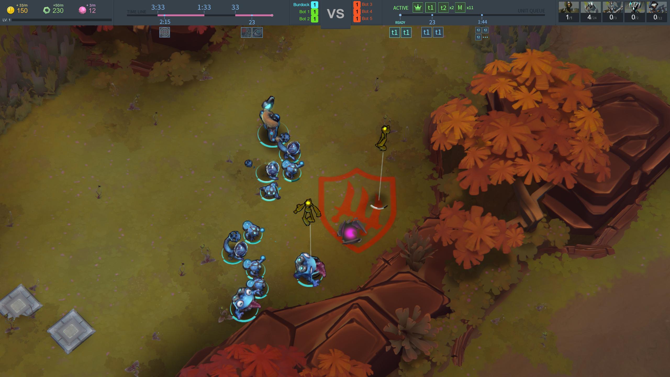
Top Bar
I found some of the UI a little strange. The fact that building units and re-spawning units were not on the same queue didn't compute with me. Not being able to see max pop from anywhere felt a little strange. Basically I just didn't get all the information I wanted via the UI.
So I decided to make a top-bar with what is quite possible far to much information ")
Hopefully most of the information is intuitive. If not, the left queue shows gem spawn times and upgrade times. The right queue shows unit arrival times, current ready units, and current alive units.
EXAMPLE (╯°□°)╯︵ ┻┻
Otherstuff
I would love to have units be individually select-able via the (selected units) screen in starcraft style. It just feels nice