The Artillery Blog
Creating the Art of Project Atlas
Can video games be art? This is a question that has drawn opinions from big names in the entertainment industry, such as famed film critic Roger Ebert or legendary game designers Hideo Kojima and Tim Schafer. If creative expression is the game designer’s goal then there are some fine examples, like Half-Life, Monkey Island and Zelda that weave engaging gameplay, iconic visuals and unique stories into a seamless tapestry which might allow it to transcend the medium.
In game development terms, art — apart from being a core discipline — is the medium through which gameplay is presented to the audience. Art not only provides the first impression which invites players into the world but also serves an important purpose in supporting and enhancing the gameplay experience. Just as cinematographers guide movie watchers on a road of rich visual storytelling, art in video games provides a rich visual framework through which players can engage with gameplay mechanics, experience its story and explore the world.
Art in games has three major functions: art for storytelling, and art for itself, and, most importantly, art for gameplay. The best companies achieve synergy of all three.

Story and Gameplay
We have a few important role models at Artillery. Pixar and Valve, for example, are commercially successful companies who weave original stories that appeal to a large audience. As a company it can be challenging to ignore tired story cliches with guaranteed audiences and, instead, tell a story about a lonely trash compactor robot who yearns for companionship, or a nerdy scientist who has to rise to the occasion by swapping his lab coat for a hazard suit and crowbar. Similarly, we share a deep yearning to tell emotionally-resonant stories with deep meaning through carefully crafted art and a rich core gameplay experience.
A story should never get in the way of gameplay; it should be complex enough for an eager core audience to dig in, yet it must be simple enough to be fertile ground for inspiring art which appeals to an audience on a visceral level.
Form and Function
The most important rule of design is that form always follows function. Consider the iPhone: a product whose brick-like form perfectly supports a multitude of complicated communication and utility functions which are constantly changing and improving to match our busy digital lives. Despite the constraints of its simple physical form, an iPhone is able to achieve aesthetic perfection through its seamless construction, tasteful use of materials, and brilliantly-simple user interface.
A successful game should have form that supports its function — the function is the entertainment provided by the game and the art is its form. A great game is able to engage its audience with fun mechanics and interesting player interaction through appealing, curated art that facilitates its gameplay principles. The discipline of art in games is a pivot point between technical constraints and graphic fidelity and is always balanced with the careful, considerate eyes and hands of an artisan.

To achieve this successful melding of art and gameplay we’ve built a game development pipeline around cycles of prototyping, play-testing, user feedback and validation. At Artillery we are organized around a system of peer groups where we brainstorm, debate, decide on the most compelling ideas and proceed with experimentation. For the art team this process is similar — experimentation means putting together reference sheets, quick sketches, concept art, 3D prototypes, and whatever else is needed to start discussions, aid decision making, and make forward progress. The goal of every discussion is to produce work that we are proud of as a team, and these discussions culminate in prototypes which allow us to have valuable, engaging audience communication.
Gameplay Through Art
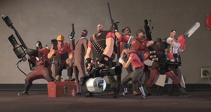
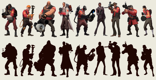
Valve is exemplary in their approach of engaging the audience by combining fun gameplay and purposeful visuals. For example, Team Fortress 2 employs strong silhouettes that convey the gameplay archetypes and properties of each individual class of character. The heavy is slow, resilient and powerful, and this is reflected in his big, brutish frame. The fast, sneaky scout has a thin and wiry frame which communicates not only his speed and knack for harassment but also his fragility.

Character colors are grouped by the red and blue of the two competing teams and are complemented by earthy skin tones and greys which allow the bright team colors to stand out. The genius of Valve’s artists can be seen in how they use the artistic restrictions to their advantage (just as Apple did with the iPhone) by purposefully marrying the restricted palette and style of Leyendecker and Norman Rockwell who were masters from the golden age of illustration.
With Left 4 Dead, lighting, filmic effects, and particles were used not only to convey a nostalgic horror movie feel but also to draw attention to set pieces where player interaction occurs. The strong archetypal silhouettes first established in TF2 are also used with great effect in the designs of the zombies, which have different abilities and personalities.
Ultimately, we believe in the value of video games as an art form that can connect people and provide value beyond just entertainment. Just as our role models have crafted timeless classics that seamlessly meld appealing art and story with innovative gameplay, we believe that the real-time strategy genre is a space that is ripe with opportunity for innovation and clever execution. We look to these modern opuses for inspiration as we seek to apply all of our learnings and inspiration to our first title, Atlas. I’m looking forward to going into detail about our specific processes and findings on the art and design of Atlas in future posts.
See also Stylization With a Purpose (Valve 2008), How Valve Connects Art Direction to Gameplay (Valve 2008), and Illustrative Rendering in Team Fortress 2 (Valve 2007).
Team Fortress 2 is copyright Valve Corporation. WALL-E is copyright Pixar Animation Studios.
blog comments powered by Disqus